Mobile Search roundup
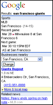
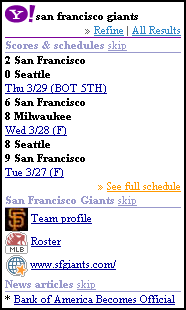
 It looks like Google has come up with an answer to Yahoo's oneSearch (review). When you visit mobile Google search (google.com/m), there's a new link at the top of the page heralding "New Try our new mobile search" Follow that link and you'll see a page that works a whole lot like oneSearch. Gone are the options to search Web, Images, Local Listings and Mobile Web. In their place is a single search box. Searches now return a mixture of results from the web, mobile web, news and images - much like with oneSearch. Again, like oneSearch, a field appears on most results pages, where you can specify a location to obtain local shopping and events results related to your query. Like oneSearch, Google lists the latest scores as the first result for queries consisting of the name of a sports team - although if you look at the image 0n the right Google doesn't list tonight's currently in progress game! Bug?
 I have very mixed feelings about this new Google Search interface. On the one hand, like oneSearch, it does typically require less keying to find what you are looking for. But, and this is huge, Google seems to have largely abandoned the mobile web as a source of  results for queries. The old Google mobile search offers a choice of searching the full web or the mobile web. The new version mixes mobile and web results together - although you will be hard pressed to find the mobile ones. There are many more web than mobile results and the mobile ones don't receive any priority, in fact they tend to be buried, often not appearing in the first screen of results at all. Google seems to think that users prefer transcoded copies of full web pages over pages designed for mobile. I don't agree. Google's transcoder is one of the best - but transcoded pages remain harder to navigate and less attractive than good mobile specific ones. This change is bad for the future of the mobile web too, Google's mobile search drives the majority of traffic to mobile sites. This de-emphasis of mobile results will cause that traffic to drop drastically I fear. oneSearch is much better in this regard with a separate category for mobile sites on the first screen of results and a More mobile web.. link that leads to pages of nothing but mobile web results.
There are some other differences between the two services. Three I noticed are:
- Google shows fewer results per page. Yahoo typically offers at least twenty or more links in five categories, Google limits itself to 10 links in three categories. Yahoo also tends to show more images. GAP recommends a maximum of ten links per page and I notice that Yahoo's results pages load much slower than Google's in the built-in Openwave browser on my Motorola i855. Much of the slowness does not seem to be the network - it just takes the browser a long time to render all those links and images. With Opera Mini on the same phone both Google and oneSearch load equally quickly. I do prefer the richer oneSearch experience if I'm using Opera but if I had to use the more limited Openwave browser I'd only use Google, oneSearch is just too slow.
- Customization: oneSearch does not seem to be customizable in any way, other than being able to toggle "safe" search. There doesn't seem to be any adaptation for browsers either. Google varies the number of links and the size and number of images depending on browser capabilities. A local search for "sushi" gives ten links and one image with the Openwave browser but 15 links and three images with Opera Mini. Google also lets the user customize a number of features of the search. Clicking a Settings link at the bottom of any page reveals the following options:
- You can toggle whether Google will save locations you have entered. This option not only makes locations persistent but also adds a drop down of recent locations to the search pages.
- Another option lets you toggle a drop down where you can restrict search to just images or local listings. There should be a option to restrict results to the mobile web here too but there isn't!
- My favorite option is the one that lets you tell Google not to transcode non-mobile pages. This is great for Opera Mini users. The Google transcoder does a good job of resizing images and reformatting pages to reduce load times and data costs and enhance mobile usability. But Opera Mini uses a web proxy that does the same thing - having them both manipulate the page is a redundant waste of time and yields worse results than either one by itself. I'd love to see Google add this option to the mobile edition of Google Reader where I'm constantly fighting with the transcoder.
- Finally, you can add content to Google search's front page, turning it into a mini home page. You can choose up to six content 'modules' from a list of 15 including stock quotes, local movie listings and weather - plus news feeds from the BBC, CNN, ESPN, Rolling Stone, E!, Slashdot and others. The news module's links lead to transcoded rather than true mobile pages. The mobile version of Google News does link mainly to mobile pages, why not do the same here? Unlike the Google Personal Mobile Homepage (google.com/ig/mobile) it isn't possible to add arbitrary feeds - on the other hand you can customize the new search page right from your phone. Setting up a mobile Personal Home Page requires a PC.
A word of warning, if you try out the new Google search interface you will be stuck with it even if you go back to the old URLs, google.com/m or google.com/xhtml. There is a way to get the old search back, go to the new Search Settings page, at the bottom of the screen you will see "You're using the new Google Mobile. (Stop)" Click on Stop to switch back.
Content: ![]()
![]()
![]() Usability:
Usability: ![]()
![]()
![]()
![]()
![]()
source: Dennis from WapReview.com


